(the ones about art not drinking)
In chapter 8 of McCloud’s book, he covers what he calls “The Six Steps.” These steps are idea, form, idiom, structure, craft, and surface. He goes into great depth of what each of these steps represents and how they are used to varying degrees in comics. He also states that all art holds these six steps and that for many, we are drawn in by the least impactful and easiest to achieve of the steps, surface, and if we are true fans of the art form then we stay, consume and create for the other steps. Essentially, most of us are drawn in by flashy covers or titles and come to truly love art for its deeper substance.
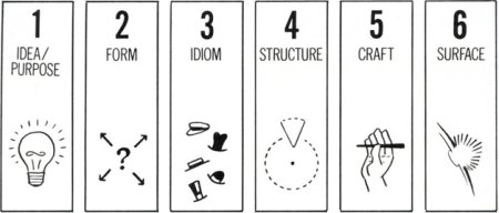
Since McCloud does a great job of detailing what these steps look like with comics, I figured I could run through a few examples of books that lack some of these important steps.
The first culprit will be the book, “What Men Know About Women.” This book is lacking the fourth and fifth step of structure and craft when it comes to books. Someone had this great idea(1), put it in book form(2), with a catchy title and cover(6) and most importantly the subject matter on the pages(3) which is in fact nothing! Yes, it is a joke book and the fact that there is no content is the content.

Another great gem that is extremely in the surface department but overwhelmingly lacking in the (every single other) department is, “A Billionaire Dinosaur Forced Me Gay.”
![A Billionaire Dinosaur Forced Me Gay by [Fox, Hunter]](https://images-na.ssl-images-amazon.com/images/I/51Kph9%2B1VoL.jpg)
This absolute masterpiece of a book is a whopping 15 pages of weird “50 Shades of Gray” spin-off that is pretty much sold off its title, the definition of all surface no substance.
Many instances of books that hold all of the steps except for surface are many first prints of true literary classics. Masterpieces of their time and still holding their place in many peoples (including mine) favorite books, such as Frankenstein, Dracula, and the Count of Monte Cristo.
These are all books built on great ideas, well written, with interesting structure, fantastic plots, and thought-provoking scenes. All tied nicely together by the hands of skillful authors that were true masters of their craft. But compared to today’s standard for book covers they all look like shit!


Dracula has a boring and terrible quality picture on the front, Frankenstein only has the title, and The Count is literally just a blank box! Yes, the modern covers are much more tasteful and put together and yes, they are old and didn’t have current printing and design technology and yes, they probably looked great for their time.
The point I’m trying to make is that not everything has to hit all the marks for us to enjoy them, and for many people, some books will hit all the steps when others don’t. At the end of the day, I just hope that more people come to appreciate this art that we call literature and if that happens to start with gay dinosaur CEO’s and leads to somewhere better, than I suppose I can live with that.
